
An ADA sign is more than a room name on a plaque. For anyone who is blind or has low vision, that small panel next to a restroom door or office entrance is the difference between navigating a building independently and having to ask a stranger for help. That’s why the Americans with Disabilities Act (ADA) sets specific, detailed requirements for how accessible signs are designed, built, and installed.
Whether you’re outfitting a new office, renovating a hotel, or bringing an older facility into compliance, this guide explains what ADA signs are, which signs actually need to comply, the exact requirements from the 2010 ADA Standards for Accessible Design, the common mistakes that cause projects to fail inspection, and what compliant signage typically costs.
Note: This article is general educational information, not legal or code-compliance advice. ADA, state, and local signage requirements vary by facility, sign type, and jurisdiction. Always verify the rules that apply to your specific project before fabricating or installing signage.
What Are ADA Signs?
ADA signs are signs designed to meet the accessibility requirements of the Americans with Disabilities Act, implemented through the 2010 ADA Standards for Accessible Design. Depending on their application, they may include:
- Raised tactile characters readable by touch
- Grade 2 Braille
- High visual contrast between characters and background
- Clear, simple typography
- Pictograms and accessibility symbols
- Specific mounting height and placement rules
Common examples include restroom signs, room and office identification signs, stairway and exit signs, accessible parking signs, and hotel room numbers. As a category, ADA signage is dimensional signage — the tactile letters and Braille are physical, raised elements, which is why compliant signs are fabricated using the same techniques as custom dimensional signs.
Which Signs Actually Need to Be ADA Compliant?
This is the question that causes the most confusion — and the most wasted money. Not every sign in a building needs Braille and raised characters. The requirements depend on what the sign does:
| Sign function | Examples | Tactile characters + Braille? |
|---|---|---|
| Permanent room/space identification | Restroom, Room 204, Conference Room, Stairwell | Yes — this is the core requirement |
| Directional/wayfinding | “Restrooms →”, “Lobby”, floor directories | Generally no (visual requirements may still apply) |
| Informational | Hours of operation, policies, menus | Generally no |
| Temporary signs | Construction notices, 7-day event signs | Exempt under the 2010 Standards |
| Building addresses | Exterior address numerals | Separate code requirements, not Section 703 |
| Parking/egress | Accessible parking signs, exit doors | Specific requirements apply (see below) |
The key test is permanence: a sign identifying a permanent room or space — one whose designation isn’t expected to change — is the classic case for tactile characters and Braille. Directional signs that simply point people somewhere generally don’t need Braille, though oversized visual characters and contrast rules may apply.
State and local codes can add requirements on top of the federal baseline. California’s Title 24, for example, is stricter in several respects. Always check local rules before you order.
ADA Sign Requirements: The 2010 Standards in Detail
Section 703 of the 2010 ADA Standards contains the technical requirements for signs. Here’s what it actually specifies, in plain language.
Raised Characters (§703.2)
Where tactile signage is required, the raised characters must be:
- Uppercase only — no lowercase, no small caps
- Sans serif — simple, conventional letterforms; no italic, script, oblique, or highly decorative typefaces
- 5/8 inch to 2 inches tall, measured by the uppercase “I”
- Raised at least 1/32 inch (0.8 mm) above the sign background — enough to be read by touch
- Proportioned within defined stroke-width and width-to-height ratios (characters can’t be too thin or too stretched)
- Duplicated in Braille directly below the corresponding text (see below)
A common misconception: making ordinary printed text physically raised does not make it compliant. The character design itself must meet the specification.
Braille (§703.3)
ADA signage uses Grade 2 Braille — the contracted form of Braille that uses standard abbreviations and contractions (the same system used in books and most public signage), not uncontracted Grade 1 letter-by-letter Braille. The requirements:
- Braille must be positioned below the corresponding raised text
- Separated from the text by a minimum of 3/8 inch
- Dots must be domed or rounded, not flat or sharp
- Dot dimensions follow precise specifications (dot base diameter, height, and spacing are all defined in the Standards)
If the message is multi-line, Braille for each line sits directly below its line of text. Fabricators verify Braille content with translation software and, on careful jobs, a human Braille proofreader — incorrect Braille is one of the most common and embarrassing failures in accessible signage.
Visual Contrast and Finish (§703.5)
For signs relying on visual readability (including the visual portion of tactile signs):
- Characters and their background must have a non-glare finish
- Characters must contrast with their background — either light characters on a dark background or dark characters on a light background
The Standards don’t mandate specific color pairs, but the contrast must be meaningful in the sign’s actual lighting conditions. White on black, black on white, and yellow on dark blue are classic high-contrast combinations.
Mounting Height and Location (§703.4)
Installation is where many otherwise-correct signs fail. The requirements:
- The baseline of the lowest tactile character must be at least 48 inches above the finished floor
- The baseline of the highest tactile character must be at most 60 inches above the finished floor
- Signs at doors must be mounted on the latch side of the door (on double doors with one active leaf, the inactive leaf)
- There must be 18 × 18 inches minimum of clear floor space centered on the tactile characters, outside the door swing arc — so a person can stand close enough to reach and read the sign without the door hitting them
Pictograms and Symbols (§703.6–703.7)
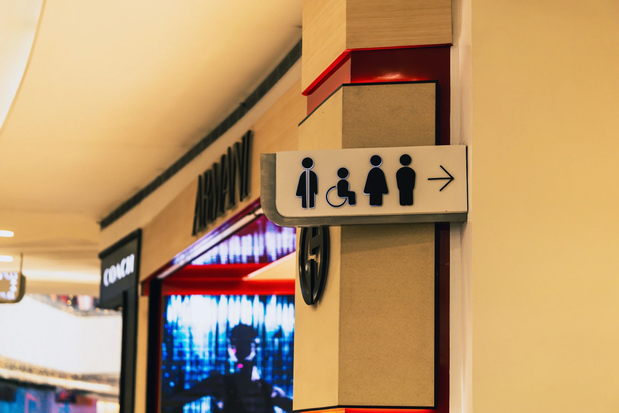
Pictograms (like the restroom gender symbols) have their own rules: the pictogram field must be at least 6 inches tall, and a text descriptor with raised characters and Braille must sit directly below it. The International Symbol of Accessibility (the wheelchair symbol) has defined proportions and must be used where accessible features are identified.
Types of ADA Signs
Room Identification Signs
The workhorse of any compliance package — offices, classrooms, conference rooms, exam rooms, storage rooms. Raised characters plus Grade 2 Braille, mounted at the latch side of each door.
Restroom Signs
The most recognizable ADA signs. Typically combine raised text (“MEN,” “WOMEN,” “RESTROOM”), Braille, and a 6-inch pictogram field with the descriptor below. Wall-mounted restroom signs are standard, but projecting (perpendicular) restroom signs — which double as corridor wayfinding — are fabricated as hanging and projecting signs with tactile elements on both faces.
Stairway and Exit Signs
Signs identifying stairwells and designated exit doors require tactile characters and Braille under the 2010 Standards. Photoluminescent or illuminated exit signage is governed by fire and life-safety codes — a separate layer of requirements to coordinate.
Accessible Parking Signs
Exterior accessible parking signs follow different rules than interior room signs — the familiar blue-and-white reserved-parking sign is governed by ADA requirements for accessible parking spaces (including van-accessible signage height), and many states add their own specifications. For exterior accessible signage, coordinate with exterior sign fabricators experienced in weather-rated materials.
Directional and Wayfinding Signs
Overhead directional signs and directories generally don’t require Braille, but visual character size scales with viewing distance under §703.5 — the farther away the sign must be read, the larger the characters.
How ADA Signs Are Made
Compliant signs require fabrication methods that produce precise, durable raised elements. The main techniques:
| Method | How it works | Best for |
|---|---|---|
| Raster Braille (acrylic spheres) | Tiny acrylic beads are inserted into drilled holes, forming rounded, uniform Braille dots | High-volume room signs; most durable Braille |
| Photopolymer | UV-cured polymer creates raised characters and Braille in one chemical process | Crisp raised text with integrated Braille |
| Routed/engraved acrylic | CNC routing cuts raised letters from acrylic sheet; Braille added via raster or engraving | Custom shapes, architectural finishes |
| Thermoformed | Heated plastic vacuum-formed over a mold | Budget-friendly, large quantities |
Substrate materials include acrylic, aluminum, stainless steel, and photopolymer panels. Acrylic dominates interior commercial work for its clean look and fabrication flexibility; metal suits architectural and hospitality projects. For any ADA sign expected to last, the tactile elements must survive years of touching and cleaning — this is not the place to cut corners on materials.
What Do ADA Signs Cost?
Pricing varies with quantity, materials, and customization. Typical US ranges as of 2026:
- Standard room ID sign (acrylic, raised text + Braille): $25–$60 each
- Restroom sign (with pictogram): $40–$90 each
- Custom/architectural ADA signs (metal, layered, brand-matched): $75–$200+ each
- Full-facility wayfinding package (50–200 signs): $2,000–$15,000+
Volume is the biggest lever — a 100-room hotel ordering identical room numbers pays far less per sign than a one-off custom plaque. Factory-direct manufacturing removes the distributor markup that typically inflates per-sign pricing.
Planning a compliance package and want firm numbers? Get a free 3D mockup and itemized quote — send your room schedule and we’ll spec every sign before you commit.
Common ADA Sign Mistakes
- Decorative fonts. Script and stylized typefaces violate the raised-character requirements and are harder to read by touch.
- Grade 1 instead of Grade 2 Braille. Uncontracted Braille on a commercial sign is a compliance failure.
- Wrong mounting height. A perfect sign hung at 66 inches fails inspection.
- Mounting on the door itself or the hinge side. Signs belong on the latch-side wall with clear floor space.
- Braille added as decoration. Braille must duplicate the raised text and sit below it with proper separation — not float decoratively elsewhere.
- Skipping local codes. Federal ADA compliance doesn’t guarantee you meet California Title 24 or your city’s amendments.
- Unverified Braille. Machine-translated Braille that was never proofread produces real signs with misspelled words in Braille — invisible to sighted installers.
ADA Sign Buying Checklist
- Identify which rooms/spaces are permanent (these trigger tactile + Braille)
- Confirm raised characters: uppercase, sans serif, 5/8″–2″, raised ≥1/32″
- Confirm Grade 2 Braille, domed dots, positioned below text with 3/8″ separation
- Verify contrast (light-on-dark or dark-on-light) and non-glare finish
- Plan mounting: latch side, 48″–60″ baseline height, 18″×18″ clear floor space
- Check pictogram rules where symbols are used (6″ field, descriptor below)
- Review state and local requirements beyond federal ADA
- Request a Braille proof before production
- Confirm installation locations against door swings and obstructions
Frequently Asked Questions About ADA Signs
Do all signs need to be ADA compliant?
No. Different signs have different requirements. Signs identifying permanent rooms and spaces need tactile characters and Braille; directional, informational, and temporary signs generally don’t — though visual contrast and character-size rules may still apply.
Do ADA signs always need Braille?
Where raised characters are required, the ADA requires them to be duplicated in Grade 2 Braille. Signs not subject to the tactile requirements (like overhead directionals) generally don’t need Braille.
What is the mounting height for ADA signs?
The baseline of the lowest tactile character must be at least 48 inches above the finished floor, and the baseline of the highest tactile character no more than 60 inches. Signs at doors go on the latch-side wall.
What colors should ADA signs use?
No single color combination is mandated. Characters must contrast with their background (light-on-dark or dark-on-light) and have a non-glare finish.
Can ADA signs be custom-designed to match my brand?
Yes. Materials, colors, finishes, and layouts can be customized around your brand — as long as the required accessibility features (character specs, Braille, contrast, placement) take priority over decorative choices.
Are ADA restroom signs required?
Restroom identification signs in covered facilities are subject to ADA requirements — typically raised characters, Grade 2 Braille, and often a pictogram with a text descriptor below.
What’s the difference between Grade 1 and Grade 2 Braille?
Grade 1 is uncontracted, letter-by-letter Braille. Grade 2 uses standard contractions and abbreviations — it’s the system the ADA Standards require on signage, and what blind readers expect in public buildings.
Plan Your ADA Signage With Confidence
Compliant signage is a system, not a shopping list: the right signs, fabricated to the right specifications, mounted in the right places. Get the specifications right once, and your facility passes inspection and serves every visitor — including the ones who read with their fingertips.
Ready to spec your ADA signage package? Send us your floor plan or room schedule and we’ll return a free mockup of your signs, a complete spec sheet matching the 2010 ADA Standards, and an itemized factory-direct quote. Request your free quote or contact our signage team — real people, same-day answers.