
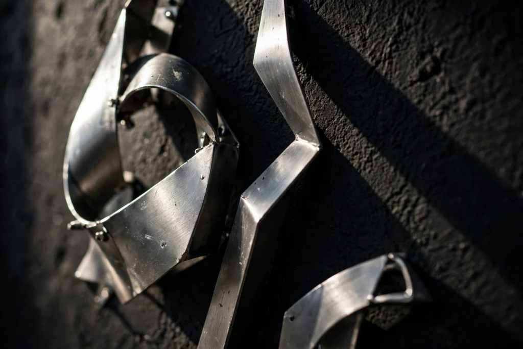
Dimensional Signs
Explore the best types of dimensional signs, popular materials, key cost factors, and expert tips to choose the right signage for your business, enhance brand visibility, and create a professional look.
Explore the best types of dimensional signs, popular materials, key cost factors, and expert tips to choose the right signage for your business, enhance brand visibility, and create a professional look.
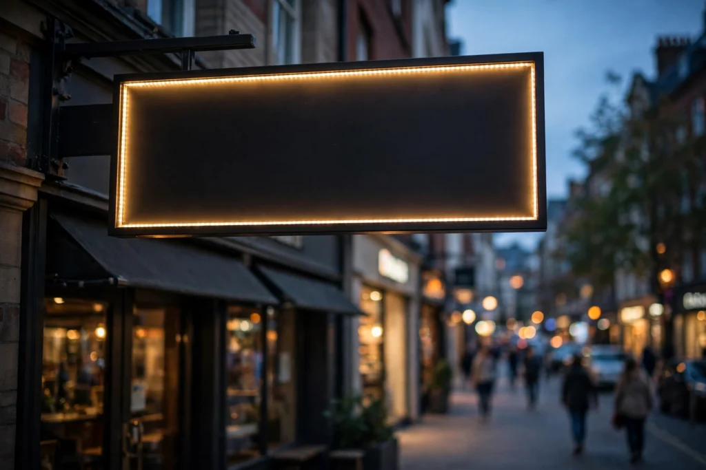
Explore the different types of blade signs, popular materials, and proven design tips to boost your business visibility, attract foot traffic, and create eye-catching storefront signage.
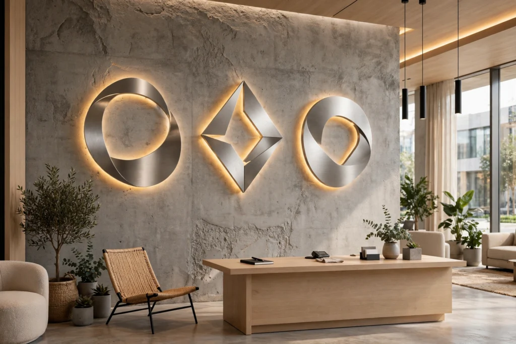
Discover the best types of interior signs for your business, including materials, creative design ideas, and smart signage solutions to enhance your workspace, strengthen your brand, and improve customer experience.
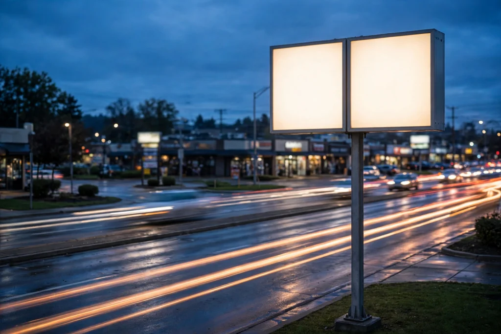
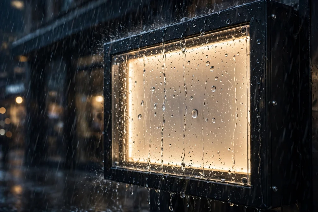
The $4,000 box that glowed wrong Consider this illustrative example (not a real project): a franchise group orders twelve cabinet signs for new locations. The spec sheet says “LED illuminated, white face.” The first sign goes up and the face glows a sickly yellow — the LED color temperature clashes with the face material. The other eleven are already in fabrication. Re-specifying the LEDs, reprinting the faces, and delaying six store openings costs the group over $4,000 per location in rework and lost time. The sign was built exactly to the brief. The brief was the problem. That story is why this guide exists. A cabinet sign — a lightbox, box sign, enclosed illuminated panel — looks like the simplest sign you can buy. It is also the sign where small specification mistakes cost the most, because every error gets multiplied across faces, locations, and years of nightly operation. This guide covers how cabinet signs are actually built, which types fit which job, how LED lighting really works inside the box, what drives cost, and how to write a brief a manufacturer can build from without surprises. Quick answer: what is a cabinet sign? A cabinet sign is an enclosed, box-shaped sign — an aluminum frame with translucent or routed faces, lit from inside by LEDs — that mounts on a wall, pole, or freestanding base. The face carries your name, logo, or message. You may also hear them called lightboxes or box signs. They are the workhorse of commercial signage: gas stations, pharmacies, restaurants, dental offices, and strip-mall tenants rely on them because a lit face keeps working long after the shop closes. For a sense of the broader landscape, see our business sign cost guide. Anatomy of the box: what you’re actually buying Ask better questions by knowing the three working parts: The shell. The skeleton is aluminum extrusion or welded square-tube; the returns are the box sides enclosing the interior. Aluminum dominates because it resists rust, stays light enough to mount safely, and takes powder coating well. On larger signs, gauge thickness and internal bracing stop being details and become the engineering — wind load on a 4×8-foot face is a real force, and a quote that doesn’t mention bracing hasn’t thought about it. The face. What the public sees. Flat acrylic or polycarbonate faces carry printed or vinyl graphics and pass light evenly. Routed aluminum faces have letters cut out and backed with acrylic — the push-through look, dimensional by day and glowing lettering by night. Pan-formed faces are vacuum-shaped for embossed depth. Polycarbonate wins where impact resistance matters (hail, vandalism); acrylic wins on clarity and color range. The lighting. LED modules mounted on the back or sides, wired to a driver (power supply). Good designs space modules so the face glows evenly — no hot spots, no dark bands. Access matters more than buyers expect: removable faces or service panels let a technician swap a driver without taking the whole sign down. A sealed box with no service access is a future removal job wearing a sign costume. The main types, and which job each does Illuminated vs. non-illuminated. Internally lit is the default for any business open after dark. Non-illuminated skips the electrical system — simpler, cheaper, fine for daytime-only businesses or sites with good external lighting. Decide early: adding lighting after fabrication can affect the sign’s electrical certification, and retrofitting a box that wasn’t designed for it is rarely clean. Single-face vs. double-face. A single-face cabinet mounts flat to a wall. A double-face has two faces back to back — the standard answer for pole signs and roadside placements, where traffic approaches from both directions. Push-through. Letters or logos routed from the aluminum face, backed with acrylic sitting slightly proud of the surface. By day: crisp, dimensional, premium. By night: glowing lettering against a dark field with excellent contrast. It costs more fabrication effort than a flat printed face, and it shows. Cabinet-letter (raceway) hybrids. Letters mounted on a slim cabinet backing — the brand reads as distinct characters while one mounted unit handles wiring and structure. The compromise between channel letters and a full box: cleaner than a cabinet, simpler to install than individual letters. Mounting follows the building and the bylaws: wall-mounted, bracket-hung, pole-mounted, or freestanding. Your sightlines and local sign code usually make this decision for you — check both before falling in love with a mounting style. How LED lighting actually works inside the box Each LED module is a small strip or cluster of diodes with a built-in lens, running on a low-voltage driver. LEDs generate little heat and draw modest power, which is kinder to the face material and the electric bill than the fluorescent tubes they replaced. Quality shows up in four details a spec sheet should name: Color temperature matched to the face. A 6500K module behind a warm-white face reads yellow. The module and the face are a system — specify them together. Even brightness, edge to edge. Module spacing is engineering, not decoration. Too sparse and you get dark bands; the fix is more modules, not brighter ones. Outdoor-rated modules and reachable drivers. Moisture-rated diodes, and drivers mounted where a technician can reach them through the service panel. Cold-weather reliability. LEDs start reliably in freezing temperatures — one genuine advantage over old tube systems — but drivers and connections still need proper sealing against condensation and freeze-thaw cycles. Cabinet signs vs. channel letters vs. monument signs No honest manufacturer tells you one type wins everywhere. The decision is about the job: Cabinet sign Channel letters Monument sign Best for Large readable face, multi-location consistency, changeable panels Upscale architectural look, brand prestige Property entrance, driver visibility Night presence Full-face glow Letter-by-letter glow Depends on design Fabrication from $49/sq ft $129/letter (front-lit) $2,900/sign Message changes Easy (swap face/panel) Hard (new letters) Moderate Weakness Can look generic at small sizes Higher cost per project Foundation + permits add cost Many sites combine types: channel letters
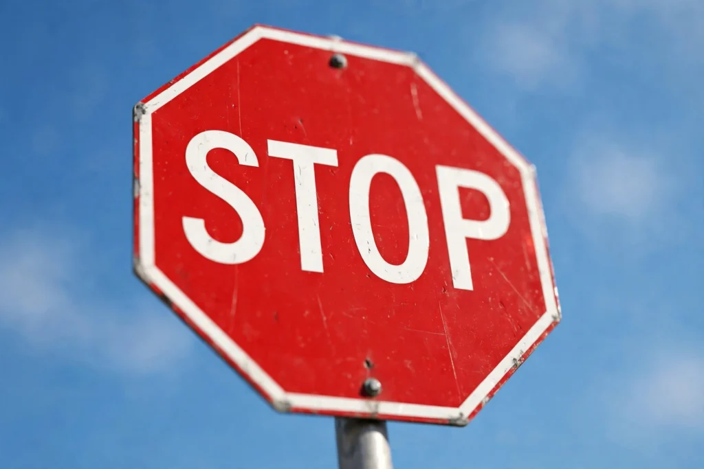
Quick answer Sign is spelled S-I-G-N. Four letters. The G is silent — the word sounds like “sine.” If that’s all you needed, you’re done. If you’ve ever paused mid-keystroke wondering whether that G really belongs there, keep reading: the reason it’s there is genuinely interesting, and there’s a pattern that makes it unforgettable. The silent G has a history (and a pattern) Sign comes from the Latin signum — a mark, a token, a signal (etymology). It traveled through Old French (signe, where the G was pronounced) into English in the early 1200s. Early English speakers said the G too. Over the centuries the sound faded from speech, but the letter stayed in print. English spelling is a museum: it keeps the history long after pronunciation moves out. Here’s the pattern that makes it stick: when a word ends in -GN, the G is almost always silent. Design. Resign. Align. Campaign. Foreign. Malign. You say the vowel and the N, and you skip the G — every time. Sign isn’t an exception; it’s a card-carrying member of the family. If you can spell design, you can spell sign. The twist: sometimes the G wakes up Add certain endings and the silent G suddenly gets pronounced: sign → signature (SIG-nuh-chur) resign → resignation (rez-ig-NAY-shun) design → designation (dez-ig-NAY-shun) malign → malignant (muh-LIG-nunt) Why? Syllable structure. The suffix pulls the G to the end of one syllable and the N starts the next, so your mouth can finally reach it. It’s the same G — it was just napping. The look-alikes that cause the real trouble Most “misspellings” of sign aren’t misspellings at all — they’re the wrong word entirely: Sign — the everyday word. A board with a message, a gesture, a signal, or writing your name. (Follow the signs to the exit. Please sign here.) Merriam-Webster lists a dozen distinct senses — which is exactly why context matters. Sine — a math term. A trigonometric function (opposite over hypotenuse). True homophone: same sound, different spelling, different meaning. Unless you’re doing geometry, you don’t want this one. Sigh — the audible breath of the tired or relieved. Ends in a long “eye” sound with no N. Different silent-letter pattern, different word. Sing — the typo. The letters are so close that fast fingers swap the G and N. “Sing here” on a contract is embarrassing. On a storefront, it’s a landmark. Quick test when you’re unsure: ask what the word is doing. Message on a board? Sign. Triangle math? Sine. Exasperated breath? Sigh. Melody with your voice? Sing. The whole family, spelled right Sign — noun and verb. The sign is above the door. Sign the form. Signs — plural, no apostrophe. (The signs are lit at night. Writing “sign’s” for a plural is one of the most common errors on real storefronts.) Signed — past tense. The G stays silent. Signing — present participle. Also the word for using sign language. Signage — the collective noun for signs (commercial, directional, architectural). Pronounced SIGH-nij, spelled with one G plus -age. For the full tour of what the word covers, see what signage actually is. Signature — where the G wakes up. Think of it as sign + -ature. And the phrasal verbs: sign in / sign out / sign up are two words as verbs; the noun forms take a hyphen (sign-in sheet, sign-up form). Three tricks so you never second-guess it again Link it to signature. If you can spell signature, you can spell sign. The G you hear in signature is the same G hiding in sign. Doubt yourself → say signature in your head → the letter appears. Use the -GN family. Design, resign, align — one correct spelling confirms the rest. Picture the stop sign. Red octagon. Four letters: S, I, G, N. The G is the quiet one. Why this matters more than a spelling quiz Here’s where it gets serious: a typo in an email is a moment’s embarrassment. A typo on a sign is large, public, expensive to fix, and visible to every customer who walks past. Signage is often a company’s first impression — a clean, accurate sign suggests care, and an error suggests the opposite, whether or not that’s fair. Professionals in the sign industry consistently rank spelling mistakes among the most common and most expensive signage errors. And here’s the part that stings: the mistake usually isn’t caught at the keyboard. It’s caught at the installation — when the sign is already built, already paid for, and hanging where everyone can see it. Which is exactly why the approval step exists. When we build a sign, the process runs: brief → free 3D mockup (targeted within two business days of a complete brief) → your review and sign-off → fabrication. That middle step — you looking at your actual sign, with your actual words on it, before anything gets cut — is where typos go to die. Nobody has ever paid to re-fabricate a sign because of a spelling error caught at the mockup stage. So spell it S-I-G-N. Check it on the mockup. And if you want the deeper story of what signs are and how they work as a system, start with our guide to signage — see how we think about signage as a system — or browse common questions about ordering custom signs. FAQs Is the G in sign really silent? Yes — in the base word, always. It only sounds in derived forms like signature and signal, where syllable structure exposes it. What’s the difference between sign and sine? They’re homophones: identical pronunciation, different spelling and meaning. Sign is the everyday word (message board, gesture, signature act); sine is the trigonometric function. Context decides. Is it “signs” or “sign’s” for more than one sign? Signs, no apostrophe. The apostrophe version is possessive (the sign’s brightness) or a contraction — never a plural. How do you spell signage? S-I-G-N-A-G-E. One G in the middle, pronounced
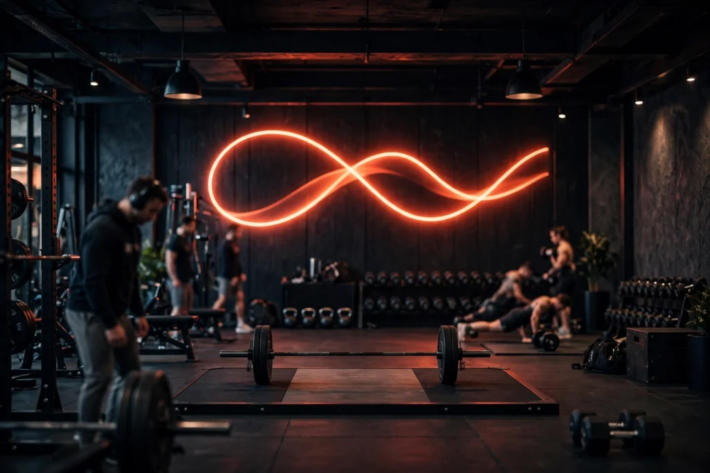
The sign that couldn’t survive leg day Illustrative example: a boutique gym owner orders a “neon sign” from a generic online seller — glass tube, the real old-school kind. It looks incredible in the product photo. Two weeks after it goes up, a medicine ball clips the wall during a class. The tube cracks, the high-voltage transformer starts buzzing, and the sign that was supposed to motivate members is now a safety incident waiting for an electrician. The replacement — an LED neon sign built for the space — costs less than the repair bill would have. That is the entire buying decision in one story: a gym is one of the harshest environments you can put a light-up sign in. High impact, long hours, humidity, chalk dust, mirrors everywhere. The product that survives it is LED neon — silicone tubing on an acrylic backboard, running on low voltage — not glass neon. This guide explains how to choose the right one, size it, place it, and avoid the mistakes that turn a motivator into a maintenance headache. Quick answer: what to buy for a gym Buy LED neon (flexible silicone tubing mounted on a cut acrylic backboard), not glass neon. It is shatterproof, runs on safe low voltage (12V/24V), stays cool, sips power, and lasts 50,000+ hours. Fabrication starts from $149/sign to your approved design (freight quoted separately). Our LED signs range covers the broader family this product belongs to. Choose a short slogan in bold lettering, size it to the wall (not the budget), get a dimmer included, and mount it where it will never face a mirror wall directly. The rest of this guide shows you exactly how. LED neon vs. glass neon: why gyms ended the debate “Neon sign” covers two completely different products. Only one belongs in a gym: LED neon (buy this) Glass neon (avoid in gyms) Tube Flexible silicone, shatterproof Fragile glass, breaks on impact Voltage Low voltage (12V/24V), stays cool High voltage (5,000V+), runs hot Power use Low — cheap to run 12–18 hrs/day High draw, adds heat to the room Lifespan 50,000+ hours 10,000–20,000 hours Maintenance None routine Gas refills, tube repairs Noise Silent Often hums or buzzes Safety on impact Absorbs the hit Shatters near people and equipment Gyms run accent lighting 12 to 18 hours a day. Old glass neon draws real power and throws heat — miserable in a small studio. LED neon’s low draw and cool operation are not just conveniences here; they are the difference between a sign you forget about and a sign you keep paying for. The Illuminating Engineering Society (IES) publishes the lighting standards commercial spaces are designed around, and low-voltage LED is the direction all of it points. The manufacturing lens: what “gym-grade” actually means Anyone can sell you an LED neon sign. A manufacturer thinks about what the gym will do to it: Impact. Dumbbells hit walls, bands snap back, bars travel. Quality LED neon uses thick-walled silicone tubing bonded to a rigid acrylic backboard — the assembly flexes and absorbs hits instead of cracking. Ask how thick the silicone wall is and how the tube is bonded to the board. Vague answers mean thin product. Runtime. 12–18 hours a day, every day, is brutal on cheap power supplies. Undersized drivers overheat, flicker, and die in year one or two — usually just after the seller’s warranty ends. A proper sign pairs the tube length to a correctly sized driver with headroom, and the warranty covers the electrical components, not just the tube. Humidity and chalk. Pool-adjacent studios, boxing gyms, and any space with heavy chalk dust need sealed connections. Ask whether the sign’s connections are sealed and what the ingress rating is if it will live anywhere damp. The dimmer is not optional. A gym needs 100% brightness for high-energy classes and 20–30% for evening stretch, yoga, or recovery sessions. A wireless dimmer controller should be included, not upsold. If a quote lists the dimmer as an add-on, the base price is not the real price. Mounting for active walls. Adhesive pads fail in warm, humid gym air. Proper LED neon mounts on standoffs or a hanging chain/kit fixed to studs — mechanical fastening, not hope. Confirm the mounting hardware is included and rated for the sign’s weight. Our commercial terms, stated plainly: free 3D mockup, targeted within two business days of a complete brief; standard fabrication targeted within 15 business days after final design approval; insured freight delivery to the United States, Europe and Australia; two-year manufacturing warranty on qualifying products, subject to the written warranty terms. Installation is by your local licensed contractor. Choosing the design: slogans, fonts, and color Short slogans win When someone is halfway through a heavy set, they read your sign from across the room, possibly through sweat. Fewer words mean larger, bolder letters that stay legible at distance: NO PAIN NO GAIN ONE MORE REP EARN IT DISCIPLINE OVER MOTIVATION BEAST MODE The rule: if it takes more than a glance, it is too long. A paragraph of motivational text becomes a blurry blob of light at twenty feet. One strong line beats three clever ones. Fonts: bold beats beautiful Thin script fonts look elegant in the mockup and disappear on the wall. LED neon renders bold, simple letterforms best — thick strokes carry the tube cleanly and read at distance. If your brand font is a hairline serif, ask the manufacturer for a bolder cut for the sign version; legibility is the product. Custom logos and graphics Simple graphic silhouettes — dumbbells, kettlebells, flames, geometric marks — pair well with text in two-color designs. Keep icons bold and simple; fine detail does not survive the tube-bending process. Send your vector logo with the brief and confirm in the mockup that the detail level works. Color and training energy Color sets the room’s energy. Common choices in training spaces: Vivid red — energy and intensity; powerlifting and heavy-lifting zones Electric blue —
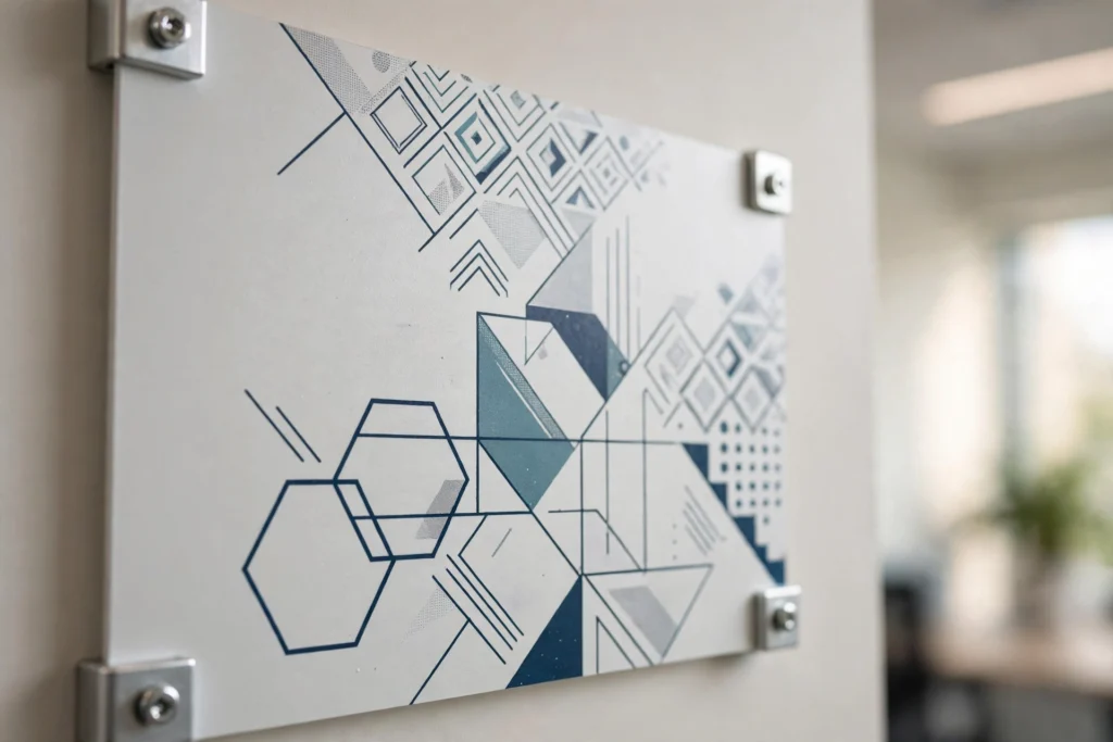
Discover 6 key benefits of PVC signs, their expected lifespan, material options, and essential buying tips to help you choose durable, affordable signage for your business.
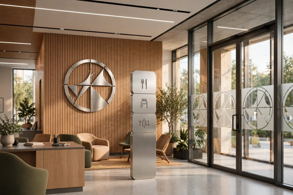
Discover the best indoor signage for your business, including wall signs, directional signs, lobby signs, and branded displays. Learn about materials, design options, and how to choose the right indoor signs to improve navigation, strengthen brand identity, and create a professional environment.

Outside business signs play an important role in attracting attention and helping customers find your business. Explore 10 smart types and ideas for outdoor business signage, including effective designs, materials, and placement tips to make your business stand out.
Complete guide to external signage: sign types, weather-rated materials, permits, design tips and typical costs. Informational guide from UrbanSign Works.